This chapter is about concrete components and how to build them in an accessible fashion using Vue. In case an inclusive component is already available and based on a vetted accessibility pattern (meaning that real people tested it and accessibility experts considered it as solid), I will refer to that and supply links.
#Modal dialogs
#How a modal should be built
Modal dialogs are one of the most commonly used patterns out there. What makes a "normal" dialog a modal dialog is its blocking character, or "modal-ness", described in chapter 3. But a modal is more than a dialog that renders everything but itself inactive. The other part of creating an accessible modal is implementing a focus management strategy.
Focus management is necessary when the element that should receive focus next is not the adjacent element to the triggering element in the DOM. Often, modal dialogs are either at the end of the DOM structurally or not yet present in the document's HTML. At the same time, the button that opens the modal is located somewhere in the middle of the document structure. Shifting focus to that point, "far away" from the trigger is called focus management. But this is only one half of it: Without focus management in place, if you close the modal after your interaction has finished, you must travel all the way back.
Keyboard focus is normally a thing that is well within the user's control, and programmatic changes to it are confusing. That's why programmatically shifting focus is a strategy that should not be overused. Having said that, intentionally changing focus is sometimes necessary: focus management leads users the users to places in the document that are in the center of visual user's attention, or have appeared subsequent to an interaction.
Modal windows are an example for this exception: after pressing a button that causes a modal dialog to open, screen reader users expect to be "taken" into said modal just after the activation. To actually let screen reader users search for the modal in the DOM would, in this case, be the unnatural choice.
However, focus management in modals is not only sending focus to the modal on opening and sending focus back to the trigger upon closing the window. There is another important aspect still missing: keeping the focus inside the modal when it is open. Implementers have to take care that the keyboard focus can't leave the modal dialog. A reminder: "modal" means "mode-changing", or in this case "blocking". So to allow the user to focus on something outside wouldn't really be blocking, right?
Let's continue with how to make the blocking part of the modal happening for all users. While mouse and touch users are prevented from interacting with the content behind the modal by a graphical overlay, screen reader users could access the content behind the modal. Unlike non-screen reader users, they are still able to navigate all of the page unless the website's author applied one of the two following strategies:
#Strategy 1: `aria-modal`
Using the attribute aria-modal="true" on the modal's container, signalling to the screen reader that only the element with this attribute should be reachable, and everything else in the document (visually speaking: the content behind the modal) should not.
#Strategy 2: Disabling parts of the DOM
In this scenario, the DOM has to be separated into two sections: one DOM subtree for the modal dialog and its contents, and another for all other parts of the site. This means: when a modal dialog is open, the second DOM subtree must be set to "inaccessible", leaving only the modal dialog reachable.
That construct is achieved with aria-hidden="true" on the "rest of the page" subtree. Keep in mind that the aria-hidden attribute is quite aggressive in a manner of speaking. If you apply it on an element, all of its children will be hidden from screen readers, too. Remember display: none in CSS where also the element and its children are hidden and can't be overridden by a display: block further down the subtree.
To demonstrate what I mean, the overall structure of the HTML should be as follows:
<html lang="en">
  <body>
    <div id="app"></div>
    <!-- #app will have `aria-hidden=true` when the dialog is open -->

    <div id="dialog-root"></div>
    <!-- this is the container for the modal dialog -->
  </body>
</html>
So which strategy should you choose? At the time of writing one screen reader is still buggy in its implementation: VoiceOver for Mac, iPadOS and iOS. Thus, the more robust option is to build a modal by ensuring the correct DOM structure (strategy 2).
To complete the theoretical description of a modal, many users expect a modal dialog to close when they hit the ESC key or click onto the overlay. It is not as important as proper focus management, but a best practice you should not forget in your implementation.
With the theory out of the way, let's finally learn how to implement accessible modal dialogs in Vue.
#Using accessible modals in Vue
The good news is that Kitty Giraudel built the pattern described above in "vanilla" JavaScript already. Wrappers for Vue and React are available.
This means my advice for accessible modals boils down to the advise: Use Vue A11yDialog, but change certain settings.
Let's dive in.
At first, install the npm package:
npm install vue-a11y-dialog@0.5.2
The Vue 3 version of the script is currently in progress. Until it is finished, please use my fork:
npm install vue-a11y-dialog-next
Then, import and use the component as a plugin, making it available in the whole app without having the need to import it (here's how to do that in Vue 3):
import { createApp } from "vue";
import VueA11yDialog from "vue-a11y-dialog";

createApp(App)
  .use(VueA11yDialog)
  .mount("#app");
Here is the Vue 2 way:
import VueA11yDialog from "vue-a11y-dialog";
Vue.use(VueA11yDialog)
Next, use the <a11y-dialog> component in another component of your choice, like this:
<template>
    <button type="button" @click="openDialog">
      Open dialog
    </button>
    <a11y-dialog
      disable-native
      id="app-dialog"
      app-root="#app"
      dialog-root="#dialog-root"
      @dialog-ref="assignDialogRef"
    >
    <!-- ATTENTION: Use @dialogref in Vue 3! -->
      <template v-slot:title>
        <span>Your dialog title</span>
      </template>
      <div>
        <p>Your content</p>
      </div>
    </a11y-dialog>
</template>
<script>
export default {
  name: "YourComponent",
  data: () => ({
    dialog: null
  }),
  methods: {
    openDialog() {
      if (this.dialog) {
        this.dialog.show();
      }
    },
    assignDialogRef(dialog) {
      this.dialog = dialog;
    }
  }
};
</script>
Finally, open public/index.html and make sure that both a <div> with id of app and a <div> with id of dialog-root are available, and in terms of the DOM, siblings:
<div id="app"></div>
<div id="dialog-root"></div>
But back to our Vue code. A lot of things are happening there:
- We are using the
<a11y-dialog>component and configuring it with props. Take a closer look atapp-rootanddialog-rootroot and compare them with the code examples above, which deal with the desired DOM structure. You will see thatapp-rootis the container that will getaria-hidden="true"when the modal is visible, and thatdialog-rootis the container in which the dialog itself will be rendered. - We are using the default slot of the
<a11y-dialog>component. Because a dialog should be labelled, there is an extra named slot for the modal's headline. - A method to open the dialog is established (
openDialog()) - We're explicitly telling the component which element should be opened by using the
assignDialogRefmethod. It is especially useful if a component houses more than onea11y-dialoginstance. But since this extends the basic usage ofvue-a11y-dialogI'll refer to the packages documentation section for details on that.
#Putting focus in the right place
vue-a11y-dialog, as well as the a11y-dialog script it is based on, follows the advice given in the WAI-Authoring Practice regarding modal dialogs (and that pattern is largely undisputed among experts). This means for focus management: On opening, the focus is put inside the modal, strictly speaking onto the first focusable element. In the case of a11y-modal this means its close button, and in the case of the Authoring Practice example, the first text input.
Putting the focus on the first interactive element of an opened modal dialog is not undisputed. It is not necessarily a problem for sighted users, but screen readers users can be irritated when the first thing they hear after a modal-triggering click is to "close the modal". Therefore, another faction of accessibility specialists prefers to focus the modal itself after making sure that it can get programmatic focus (tabindex="-1"). When something is focusable it needs to have a role (role="dialog" or role="alertdialog" in this case), and an accessible name to make sense to the user. We are using aria-labelledby="IDREF" for that, pointing to the modal's headline. You can see how this whole construct is made in Scott O'Haras "Accessible Modal Dialog".
<div id="the-dialog" aria-labelledby="DialogHeadlineId" role="dialog" tabindex="-1">
</div>
Regarding where to put the focus, it is not possible to give out a final piece of advice at this time, and possibly, ever. Adrian Roselli wrote a whole article on this and comes to a conclusion that the individual modal needs to be tested with as many of your users as possible. The danger of the Authoring Practise is, as he rightly mentions in the article, that moving focus to an interactive element can irritate some users. So the take-away here is: please test your assumption with users.
#Conclusion
Until every major screen reader supports the aria-modal attribute fully, and until the accessibility of the <dialog> element is fixed across browsers, the most reasonable and robust choice is "the tale of two subtrees" (strategy 2 from earlier). For Vue, you don't have to start totally from scratch but should use vue-a11y-dialog. To maximise its accessibility, you should add disable-native to <a11y-dialog> for the time being. Lastly, it is good advice to run (user) tests regarding the position of initial focus.
You can see a Vue 2 Codesandbox of vue-a11y-dialog here. The Vue 3 version can be found at here.
#Skip links
#Basics
Skip links are basically internal anchors to jump to different sections within a document. As such, they are important tools for people who don't use a mouse to navigate on a page (be it keyboard only or screen reader users). "Bypass links" like these could be visible all the time but are mostly only visible when focused.
It is important for a bypass link (or a collection of them) to be the first focusable item(s) in the document - so that the very first stroke of the keyboard's TAB key (or the first interaction with other devices that emulate this very key) leads to a skip link being focused.
The bird's eye view of a skip link is like this:
<!-- ... -->
<body>
    <a href="#main" class="onlyVisibleOnFocus">Skip to main</a>
    <!-- other content, e.g. logo, main nav -->
    <main id="main">
    <!-- ...main content... -->
    </main>
</body>
#Skip links in Vue
This is rather easy due to the existence of Vue A11y's vue-skip-to library. Imagine the following situation: Your main content is marked up with a <main> landmark (how it should be) and has an ID of main as well, so that it can be directly linked (like so: https://site.tld/#main).
First, of course, you install the library. Depending on your Vue version, that's the following code for Vue 2:
npm install @vue-a11y/skip-to --save-dev
The Vue 3 version of vue-skip-to is available on the next branch:
npm install @vue-a11y/skip-to@next --save-dev
After that, the installation also differs and is dependent on your Vue version.
For Vue 2:
import Vue from 'vue'
import VueSkipTo from '@vue-a11y/skip-to'

Vue.use(VueSkipTo)

new Vue({
  //...
})
For Vue 3:
import { createApp } from 'vue'
import App from './App.vue'
import VueSkipTo from "@vue-a11y/skip-to";
import "@vue-a11y/skip-to/dist/style.css";

createApp(App)
  .use(VueSkipTo)
  .mount('#app');
Now, place the <VueSkipTo /> component itself in your app's template. Remember - it is essential that the skip link is the first interactive element in a document. Given that the ID of your main content area is still "main", the template part for your App.vue could look as follows:
<template>
  <div id="app">
    <VueSkipTo to="#main" label="Skip to main content" />

    <!-- header, navigation, and more -->

    <main id="main">
      <!-- content -->
    </main>
  </div>
</template>
That's it for basic usage. As you can see in the code above the props to and label are available (but not required. They default to #main, or the string Skip to main content, respectively).
In addition to this basic use, VueSkipTo also offers other options, such as the convenient use of multiple jump links and destinations. For details about this, check out the "Skip-to list" section of the project's readme.
You can see a Vue 2 Codesandbox of this code here. The Vue 3 version can be found at here.
#Slide-In Navigation
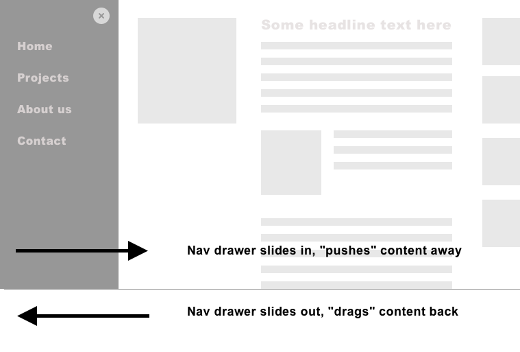
When you read the section about modal dialogs, slide-in navigation's recommended focus management pattern will look familiar to you.
As always, our main goal here is to make the change of focus comprehensible and ensure that focus does not get lost or reaches parts of the page that are considered "inactive".
In concrete terms, this means for the slide-in navigation:
- Focus should not get into the navigation it is in its closed state. Links or buttons inside the navigation must not be reached accidentally.
- Once the navigation opens, the focus should be programmatically sent into the navigation.
- While the navigation is in its "open" state, focus must remain in the navigation, and we have to prevent that users can focus focusable items outside of it. So we have to use some form of focus trapping mechanism. However, this also means that you must offer at least one way to close the navigation (explicit button or
ESCkey). - To reverse the opening behavior and to mirror the modal dialog pattern, once the navigation closes, focus must be sent to the button that opened the modal in the first place.
Let's build an accessible slide-in nav, and let's start with the basics.
In our example, there's an App.vue file, doing what a central starting point is usually doing. For the sake of this demonstration, it has some dummy content and links in it (to help to check if they can be reached when the slide in nav is open). And there is, of course, a component for the nav itself:
<template>
  <div>
    <SlideInNav />
    <p>
      Lorem Ipsum is simply dummy text of the printing and typesetting industry. Lorem Ipsum is simply dummy text of the printing and typesetting industry. <a href="#">Link</a>
    </p>
  </div>
</template>

<script>
import SlideInNav from "./components/SlideInNav";

export default {
  components: {
    SlideInNav
  },
};
</script>
Let's zoom into SlideInNav.vue. We start by looking at the overall template structure.
<template>
  <div>
    <nav>
      <button @click="toggleMenu">Menu</button>
      <div class="nav-container" :class="{ open: navOpen }">
          <div>
            <button @click="toggleMenu">Close Menu</button>
            <ul>
              <li>
                <a href="#">Home</a>
              </li>
              <li>
                <a href="#">About</a>
              </li>
              <li>
                <a href="#">Contact</a>
              </li>
            </ul>
          </div>
      </div>
    </nav>
  </div>
</template>
Nothing special here: We got a central root <div> element (that we are going to need for at least Vue 2, but also for a key event listener later). Inside it, we got a button that, when clicked, toggles the visibility state the menu. Next, we got a <div> with a class of nav-container.
Following, the script part: Here, we find the aforementioned navOpen as a reactive property (which is the central piece of state for this component), and a method to toggle it called toggleMenu.
<script>
export default {
  data() {
    return {
      navOpen: false,
    };
  },
  methods: {
    toggleMenu() {
      this.navOpen = !this.navOpen;
    },
  },
};
</script>
If you look back into the first template snippet, you will see that the open class is only applied to the nav-container div when navOpen is true.
Lastly, let's take a look at the style block. Here we specify that the eponymous slide-in effect is done with CSS. .nav-container starts offscreen, has position: fixed and an explicit z-index of 10. Only when nav-container has the class open it will be visible (by resetting the transform property to none). A small animation of transition: all .5s ease 0s takes care of the slide-in effect itself. Both the selectors for body and enhanced focus styles you'll find in the following code snipped are not strictly necessary, but are going to help us debug and especially see more clearly where the focus is currently.
<style>
.nav-container {
  transform: translate3d(-100%, 0px, 0px);
  transition: all 0.5s ease 0s;
  background: #c7cdea;
  position: fixed;
  top: 0;
  right: inherit;
  z-index: 10;
  width: 300px;
  height: 100%;
}

.nav-container.open {
  transform: none;
}

*:focus {
  outline: 2px solid;
}

body {
  padding: 0;
  margin: 0;
}
</style>
Many developers stop at this point. But you, dear reader, are aware that we haven't even started with the focus management part. Our next step is to install the script vue-focus-trap, which deals with the focus trapping (hence the name) but also assists with sending the focus in and out of the navigation, on open or close events, respectively.
Please note that, at the time of writing, the Vue 2 version of this script is on its repository's master branch, whereas the version for Vue 3 can be found on its next branch.
npm install focus-trap focus-trap-vue@3.1.0
npm install focus-trap focus-trap-vue
Following the installation, we put the component to use. I would recommend registering the component in your app's main JavaScript file (main.js, if you are using vue-cli) globally:
import { createApp } from 'vue';
import { FocusTrap } from 'focus-trap-vue';
import App from "./App.vue";

const app = createApp(App);
app.component('FocusTrap', FocusTrap);
import Vue from 'vue';
import { FocusTrap } from 'focus-trap-vue';

Vue.component('FocusTrap', FocusTrap);
Having done that, we now have a component at hand with the help of which we could define the parts of our app or components that should trap focus under certain circumstances. Nevertheless, and since focus trapping is usually a bad thing to do, we have to be explicit about these. The focus should be trapped inside the nav only when it's open. For this, we can use v-model on the <focus-trap /> component (comment 1).
<template>
  <div>
    <nav>
      <button @click="toggleMenu">Menu</button>
      <div class="nav-container" :class="{ open: navOpen }">
        <focus-trap v-model="navOpen" v-if="navOpen"><!-- 1 -->
          <div tabindex="-1">
            <button @click="toggleMenu">Close Menu</button>

            <ul>
              <li>
                <a href="#">Home</a>
              </li>
              <li>
                <a href="#">About</a>
              </li>
              <li>
                <a href="#">Contact</a>
              </li>
            </ul>
          </div>
        </focus-trap>
      </div>
    </nav>
  </div>
</template>
<!-- etc --->
Now, the focus trap is only active when navOpen is true. Even more so, the focus trap DOM subtree is only existing when navOpen is true. By not rendering the trap and all of its children in a closed state, we prevent that the links inside it can be reached via keyboard if the navigation is not on screen (read: navOpen is false). Still, we made sure that the <nav> element (the navigation landmark) is rendered in any case.
Remember step 2 of our desired focus management agenda: sending the focus into the slide-in navigation once it's open. Luckily, the FocusTrap library takes care of this almost completely: it focuses its direct child on activation by default. In order to make a non-interactive element focusable (but leave it out of the tab order), we have to apply tabindex="-1".
Step 3 of our agenda from the beginning of this section of the book states that focus must be kept inside the navigation when it's open (the only way out is to close the navigation, of course). This is the core functionality of <focus-trap>.
With this, we have got two of the four essential parts of slide-nav related focus management complete. What is still missing is the explicit sending of the focus inside the nav (on "open") and back to the triggering button (on "close"). Conveniently, we can also use <focus-trap> for that:
<template>
    <!-- etc --->
    <nav>
      <button @click="toggleMenu">Menu</button>
      <div class="nav-container" :class="{ open: navOpen }">
        <focus-trap v-model="navOpen" v-if="navOpen">
        <!-- close button and navigation links --->
       </focus-trap>
      </div>
    </nav>
</template>
The only thing left is the closing of the off-canvas nav via ESC key. This is what the root <div> was for and why it is needed even in the Vue 3 version of the code. The FocusTrap library allows us to deactivate the trap via ESC keypress, but this is not enough in our case. We want to deactivate the trap, and remove it from the virtual DOM and close the menu. For this reason, we set navOpen to false on keydown of ESC (See comment 2).
<template>
  <div @keydown.esc="navOpen = false"><!-- 2 -->
    <nav>
      <button @click="toggleMenu">Menu</button>
      <div class="nav-container" :class="{ open: navOpen }">
        <focus-trap v-model="navOpen" v-if="navOpen">
          <div tabindex="-1">
            <button @click="toggleMenu">Close Menu</button>

            <ul>
              <li>
                <a href="#">Home</a>
              </li>
              <li>
                <a href="#">About</a>
              </li>
              <li>
                <a href="#">Contact</a>
              </li>
            </ul>
          </div>
        </focus-trap>
      </div>
    </nav>
  </div>
</template>
This completes our accessible slide-in navigation. It is rather hard to convey especially animation in pure text form, so please do check out the CodeSandBox examples for Vue 2 and Vue 3.
As mentioned before, both CodeSandBoxes differ only regarding details (main.js, versions of the FocusTrap library suitable for the respective versions, and versions of focus-trap-vue). The overall construction, and especially the focus management, remains the same.
#Menus
What is on your mind if I just write the word "menu" without giving further context? I bet that either you are not sure what exactly it is referring to (because it is an umbrella term), or you come to a definition of the word that differs from the next person.
Unfortunately, that is one of the main issues when dealing with "menus" in accessibility. "Menu" alone is not enough, and in order to be more precise and to not confuse different things, especially in the web app context, we have to establish two much more pronounced terms. After this distinction is made, I will present ways to build the one or the other in Vue.
#Navigation menus
The first question one has to ask is, "What purpose does the component have?". Is it a list of items that - upon interaction - leads to another page, route or file, respectively? See how I described the word "link"? Do these items lead to web app states that can be reached under their own URLs? If so, you are likely building a navigation menu.
In the wild, navigation menus are often found in mobile or narrow screen contexts where a part of the navigation collapses into "a menu" either completely, or only part of it does.
You read about the concept of a disclosure widget in the last chapter, and this is actually the best choice for a navigation menu (Quick aside: I learned this with a detour, hat tip Heydon Pickering. Simple solutions are most of the time the best ones).
Let's imagine you have an e-commerce app which has an account button. Your designer's concept is that, once the button is clicked, a container with two links appears. The first item being "Past Orders" (and it leads to a route where your past orders are listed), the second one being "My Address", which leads to a route (or page) where you can change your postal address(es) for delivery. Probably you would build such a component like this:
<template>
    <div>
        <button
            @click="toggleOpen"
            :aria-expanded="!open.toString()">My Account</button>
        <div :hidden="open">
            <ul>
                <li><a href="#">Past Orders</a></li>
                <li><a href="#">My Address</a></li>
            </ul>
        </div>
    </div>
</template>
<script>
export default {
    data() {
        return {
            open: false
        }
    },
    methods: {
        toggleOpen() {
            this.open = !this.open;
        }
    }
}
</script>
You may recognize the pillars of the disclosure widget. Since it is a central widget pattern for accessibility, let's reiterate its important parts here:
- I chose a button as the triggering element. Thus, the
@clickevent listener also listens toSPACEandENTERkey events. This comes for free because when using the<button />element. - I made sure the disclosed content comes right after the button in the DOM.
- The disclosed content has the
hiddenattribute on its container (therefore is hidden to all users). The value ofhiddenattribute is made reactive. Initially, it is set to the opposite ofopen(!open). Also, the button indicates that interaction with it influences the perceptibility of another element. Unlike the reactivehidden, I made sure the boolean that is the value ofaria-expandedis cast into a string. Otherwise, Vue wouldn't render the attribute altogether when it's falsey. Alas, in this case, users of assistive technology would not notice that this button has a disclosure-toggling function. So thearia-expandedattribute has to stay present under all circumstances. - As you can see from the slim
<script>block, no focus management.
Now that navigation menus should be the most common form of menus, it totally makes sense to put the "disclosure widget" parts into a component and let other components use instances of it.
Find working "navigation "CodeSandBoxes for Vue 2 here and Vue 3 here.
#Action Menus
Most of the menus you are about to build in your apps will come down to navigation menus (and, therefore, to disclosure widgets).
Some menus of your web app are meant to behave like the menus of your machine's operating system. When you click a menu item, something should happen (for example, your printer should start to do its job). In web development (and semantics), we got the general distinction of interactive elements that "lead to places" (links) and ones that "change state", or, sloppily put, "do something" (buttons). So, if a menu exclusively consists of actionable items, and you are aware that you a) will need to implement a special keyboard pattern and b) will send most screen readers into a special "app mode" – only then use the action menu concept.
However, even then you have to buckle up for a much more complex pattern. If I would describe it in detail here, making the subsection about action menus way longer than the one with the easy and rather short pattern of navigation menu – and then I would be doing accessibility a disservice. A complex pattern leads to more explanations and code examples, which leads to more text. This itself could lead to "perceived importance" of this pattern, which I'd like to avoid (because a disclosure widget is a right choice for 99% of your menu needs).
I try to solve this dilemma by pointing you to two resources:
- The official authoring practice on action menus. The practice itself is not really disputed among experts (that's why I point to it), but it's actually the naming and tutorials around it. In the practice's description, you can and should learn about what WAI-ARIA structures and especially what keyboard behaviour is needed.
- A Vue implementation of this pattern on CodeSandBox with inline comments. It is quite complex and, franky, only worth visiting when you came to the decision that you really need an action menu built in Vue.
To conclude: When you look into the linked Vue implementation, you'll learn that an action menu (according to the Authoring Pattern) is a complex beast, and most of the time, not worth the hassle.
Oh, and one thing about the ARIA roles of menu and menuitem you'll find in the implementation: These roles are intended for action menus only and should not be used for navigation. "Menu item" is here synonymous with "action menu item". Like I said, the situation around the term menu is broken beyond repair.
Finally, if you only remember two things of this section, make it these:
- If in doubt, use the disclosure widget pattern (as described in chapter 2, and above).
- Use
role="menu"androle="menuitem"sparingly and not for navigation purposes.
#Tab Component
The last section about "menus" and the lack of a clear definition of what it is set the stage for this section. It is about "tabs", and I have to start with a vocabulary lesson again, since the word "tab" is so short and practical it got used for many things at once. Alas, this made things somehow difficult. "Tab" can mean the TAB key (to shift focus from one focusable item to another), "to tab" can also be a verb (to describe that very focus shifting or hitting the tab key), and last but not least a "tab pattern" is an interface concept.
The latter is about showing and hiding things, and I will call it "tab component" in this section. It has a trigger (the "tabs", in a "tablist") and something that is conditionally visible (the "tab panel"), based on which trigger is active. So far, so comparable to a disclosure widget, isn't it?
Yes and no, tabs as an interface concept is in some regards different to a disclosure widget since it tries to simulate physical tab folders. Further differences are:
- its triggers are placed vertically
- one panel is visible at the start
- You can navigate from trigger to trigger very quickly
- Depending on the variant you build, just the event of focusing a tab (the trigger) reveals the tab panel (as in: the content related to the respective trigger). A disclosure widget would never open its hidden content when the trigger merely is in focus. It would need a click for "disclosure".
#How a tab component should be built
The Authoring practice for the tab component is one of the rather undisputed once. However, there are two different "flavours" when it comes to behaviour. Regardless of that, both share the same HTML structure, as follows:
<div class="tabs">
  <div role="tablist" aria-label="Entertainment">
    <button role="tab"
            aria-selected="true"
            aria-controls="nils-tab"
            id="nils">
      Nils Frahm
    </button>
    <button role="tab"
            aria-selected="false"
            aria-controls="agnes-tab"
            id="agnes"
            tabindex="-1">
      Agnes Obel
    </button>
    <button role="tab"
            aria-selected="false"
            aria-controls="complexcomplex"
            id="complex"
            tabindex="-1"
            data-deletable="">
      Joke
    </button>
  </div>
  <div tabindex="0"
       role="tabpanel"
       id="nils-tab"
       aria-labelledby="nils">
    <p>
      Nils Frahm is a German musician, composer and record producer based in Berlin.
    </p>
  </div>
  <div tabindex="0"
       role="tabpanel"
       id="agnes-tab"
       aria-labelledby="agnes"
       hidden="">
    <p>
      Agnes Caroline Thaarup Obel is a Danish singer/songwriter.
    </p>
  </div>
  <div tabindex="0"
       role="tabpanel"
       id="complexcomplex"
       aria-labelledby="complex"
       hidden="">
    <p>
      Fear of complicated buildings:
    </p>
    <p>
      A complex complex complex.
    </p>
  </div>
</div>
When you just look at the roles, you will see a tablist with tabs in it. These are the triggers. The panels (containing the conditionally shown content) follow right under the list of triggers. Unlike the tabs, these tab-panels aren't wrapped in a container like tab-panel-list. Tabs and tab-panels are programmatically tied together with aria properties using so-called IDREF's: aria-controls refers to an id of one particular tab-panel, and this tab-panel's accessible name comes from the text content of its related tab (aria-labelledby="ID_OF_TAB").
What I obviously cannot really present in a static book is the expected dynamic behaviour of a tabpanel. Imagine you are using a website with a tab component with keyboard only, so you tab along everything focusable. Once you reach the tab-list, the focus is set on the first tab. At the same time, the associated tab-panel is shown.
From here on there are two possible ways of what could happen. These are the "flavours" I was writing about earlier (and a decision for either one should be based on user research):
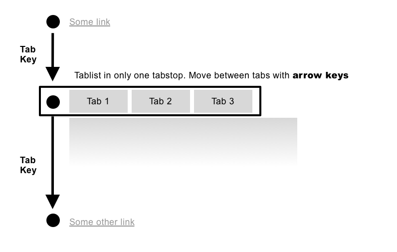
In scenario 1, when your focus is on a tab, you're using the arrow keys to cycle through all tabs (and therefore activating tabpanels) one by one. This concept is called "roving tabindex". Here, the next press of the TAB key leads you out of the tablist but onto the next focusable item (which could be a link inside a tabpanel, for example).
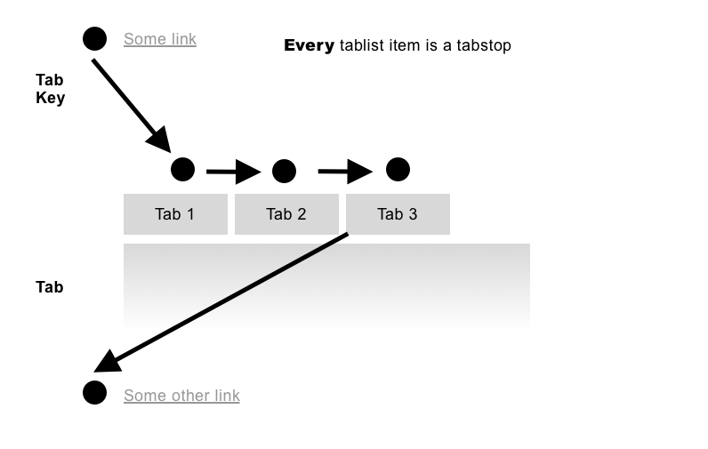
Scenario 2 is built in a more familiar way: you need to press the TAB key to go through the tabs, and you need to activate them if as they were buttons (ENTER, SPACE, or the respective activation shortcut of your screen reader. Or, of course, a click or touch).
Let's demonstrate how to implement the Authoring Pattern scenario 1 code more or less verbatim into Vue.
#How a tab component can be built in Vue
Actually, a tab component can be created in several ways in Vue. I decided to showcase an approach which appears to me as the most flexible one. Let's start with a bird's eye view of the component and from the vantage point of a component that uses our tab component. This lets us get an idea of what we are about to build:
<template>
    <MyTabs :tabs="tabs" :initialTab="initialTab">
      <template slot="tab-vue">Vue</template> <!-- (1) -->
      <template slot="panel-vue"> <!-- (2) -->
        <h2>Vue.js</h2>
        <a href="#0">Link</a>
      </template>
      <template slot="tab-react">React</template>
      <template slot="panel-react">
        <h2>React</h2>
        <a href="#0">Link</a>
      </template>
      <template slot="tab-angular">Angular</template>
      <template slot="panel-angular">
        <h2>Angular</h2>
        <a href="#0">Link</a>
      </template>
    </MyTabs>
</template>

<script>
import MyTabs from "./MyTabs";

export default {
  name: "App",
  components: {
    MyTabs
  },
  data() {
    return {
      initialTab: "vue",
      tabs: ["vue", "react", "angular"] // (3)
    };
  }
};
</script>
In the code example above, you see:
- Named slots for tabs and tab-panels, respectively (comments 1 and 2).
- An array, holding unique "slugs" for each tab(panel), and an
initialTabsetting (comment 3). - The slot names follow a certain naming pattern:
tab-${slug}/panel-${slug}. So for example:tab-vueandpanel-vue.
Now, let's zoom into the MyTabs component itself. Firstly, we take a look at the template part and already find many things happening here: WAI-ARIA widget roles of tablist, tab and tabpanel, looping through the tabs array passed in via the "tabs" prop, dynamic slot names, dynamic ids, dynamic state for aria-selected and aria-controls, a dynamic value for tabindex, keydown and click events.
<template>
  <div>
    <div class="tab-heads" role="tablist" ref="tablist"><!-- (1) -->
      <button
        role="tab"
        v-for="tab in tabs"
        @keydown="keydownHandler"
        @click="switchTab(tab)"
        :key="tab"
        :tabindex="activeTab === tab ? 0 : -1"
        :aria-selected="activeTab === tab"
        :aria-controls="panelSlot(tab)"
        :id="tabSlot(tab)"
      >
        <slot :name="tabSlot(tab)"></slot>
      </button>
    </div>
    <div role="tabpanel" :aria-labelledby="activePanelSlot" :id="panelSlot(tab)"><!-- (2) -->
      <div class="tab-panel">
        <slot :name="activePanelSlot"></slot>
      </div>
    </div>
  </div>
</template>
To proceed step by step: In the code above, you see the familiar tab component structure: a tablist (comment 1), and a tab-panel (comment 2). We loop only over the tabs array (we received as a prop). It is important the length of the array matches the numbers of tabs. The tabindex of each tab is also a dynamic property. You can see by the ternary operator that tabindex value renders to either "0" (manually focusable) or "-1" (only programmatically focusable, and: not manually focusable). This is all dependent of the comparison activeTab === tab. Again, this construct of dynamically changing tabindex values is dubbed "roving tabindex". Watch episode #6 of Rob Dodson's A11yCasts to learn more.
Next, let's look at the ARIA parts of the template code. You might find familiar roles such as tab, tablist and tabpanel, which describe the semantic structure of the tab component to user agents. In addition to that you see the WAI-ARIA state aria-selected, which is either false or true, depending on whether the tab is selected (that again, is determined by the comparison activeTab === tab. Lastly, we got an IDREF in the form of the aria-controls relationship attribute. This is a reference from the tab (trigger) to the tabpanel (corresponding content), which is activated by navigating to, or activating the tab, respectively. In this context, the value for a tab's id is created though the tabSlot function, based on the "tab slug" (more on that in the script part below).
Please be aware that we loop over tabs but not over tabpanels. Since at any given point in time, only one panel is visible/perceivable - the one that is active - it is not necessary to even render the other ones.
Lastly, let's look into the names of the tab slots. Since we're dealing with a loop here, we have to ensure two things. Firstly, that they are dynamic, and secondly, match the items of the tab array (passed in as a prop) we are looping over. The final slot name is created by the return value of the tabSlot function with the current tab passed in as a parameter.
<script>
export default {
  props: { // (1)
    initialTab: String,
    tabs: {
      type: Array,
      required: true,
    },
  },
  data() {
    return {
      activeTab: this.initialTab || this.tabs[0] // (2)
    };
  },
  computed: {
    activePanelSlot() {
      return `panel-${this.activeTab}`; // (3)
    },
    activeTabSlot() {
      return `tab-${this.activeTab}`;
    },
  },
  methods: {
    tabSlot(tabName) {
      return `tab-${tabName}`;
    },
    panelSlot(tabName) {
      return `panel-${tabName}`;
    },
    switchTab(tabName) {
      this.activeTab = tabName;
      document.getElementById(this.tabSlot(tabName)).focus(); // (4)
    },
    keydownHandler(e) {
      let activeIndex = this.tabs.indexOf(this.activeTab), // (6)
        targetTab;


      switch (e.key) {
        case "ArrowLeft":
          if (activeIndex - 1 < 0) {
            targetTab = this.tabs[this.tabs.length - 1];
          } else {
            targetTab = this.tabs[activeIndex - 1];
          }
          this.switchTab(targetTab);
          break;
        case "ArrowRight":       // (7)
          if (activeIndex + 1 > this.tabs.length - 1) {
            targetTab = this.tabs[0];
          } else {
            targetTab = this.tabs[activeIndex + 1];
          }
          this.switchTab(targetTab);
          break;
        default:
          return;
      }
    },
  },
};
</script>
Now, turning to the script part of the MyTabs component, let's look at the props part first. While tabs as a prop is very central to the component at this point, we have to make sure that it is an array. We have to make sure as well that a string gets passed in as the value of initialTab (comment 1 in the code above). As for our reactive state, we make sure that we either start with the tab that is provided by the initialTab prop or the first item of the tab array (see comment 2).
In a rather simple form of name calculation, marked with comment 3, we fill the computed property activePanelSlot with the name of the active panel prefixed by the string panel-. The same happens for the tab (read: the trigger).
What comes next are two methods (tabSlot, panelSlot) that can be considered as enhanced computed properties setup. Both return a string that is used as a tab slot or tabpanel slot name, respectively, but both get passed in a tabName string as a parameter.
Following that, the switchTab function takes in a tabName function argument as well, sets the currently active tab to the value of it and focuses the tab itself (comment 4). If you are reading this last sentence and wondering why it is necessary to manually focus, keep in mind the circumstances the method switchTab is usually called: it is either a click on a tab (see @click event in the template part), or a change of the active tab caused by arrow key interaction.
And this is exactly what is happening in the last, rather big method, "keydownHandler". At first, we find out the index of the active tab within the overall tab array (comment 6). Following is the analysis of what key was hit. In the case of ArrowLeft, we check whether the focus should be set to the tab left from the currently active one (and in this context active at) or if we are already, visually speaking, on the left edge and should instead send the focus to the last tab, which is the most outward one on the right side of the tablist. For the handling of the ArrowRight key, it is more or less the other way around, as you can see in comment 7. This looping is the final part of the roving tabindex concept. With the horizontal arrow keys alone, we now made sure that we activate a tab on every arrow keypress, no matter where in the tablist we exactly are.
Lastly, and dogmatically speaking totally unnecessarily, we add some very basic styling in order to spot the currently active tab.
<style scoped>
[role="tab"] {
  display: inline-block;
  margin-right: 1ch;
}

[role="tab"][aria-selected="true"] {
  font-weight: bold;
}
</style>
In this further case of a highly dynamic widget pattern purely described in text form, please check out the corresponding CodeSandBox for a Vue 2 version and for Vue 3 respectively. Please note that apart from the initialization of the main App component in main.js, and a different slot syntax, the code is exactly the same in both sandboxes.
#Aside: Component libraries
When it comes to component libraries, it is rare that creators "market" their product with accessibility features. Rather, they try to sell it by emphasising its great developer experience, it being lightweight or especially pleasing for the eye. And there's nothing wrong with that. The point is that one oftentimes must go deep in the documentation to find a mention of accessibility considerations – if at all.
The fact of the matter is: Only a small percentage of component libraries are accessible. Sadly, accessibility is a low priority in web development overall, and component libraries are no exception. Many provided components aren't close to being accessible, and some of the libraries try to stick to WAI-ARIA authoring practices dogmatically. Read chapter 2 why this can go wrong, and why Authoring Practices aren't exactly gospel. Further, many packages are not accessibility tested, causing major issues in semantics, styling or behaviour of the page itself.
This leads me to the following conclusions regarding component library analysis, and they aren't as convenient as a concept of a "plug and play" library promises:
- Vet your component library candidates for accessibility! Hidde de Vries wrote an inspiring article on the most important parts of this process.
- Lookout for component libraries that are in general considered accessible and are actually regularly tested with people with disabilities. These libraries may not be available as a Vue component package, and for this reason easy to install. However, if an accessible UI library exists in "vanilla JavaScript", the hardest part has been done, and it's "only" the transformation into Vue components that's left.
- Since it feels like accessibility as a topic for Vue is only starting, I'm positive that reasonable, accessible, complete and easy-to-install components for Vue will appear soon. To stay on the ball easier, subscribe to the people I recommend in chapter 7. I'm predicting that libraries will appear, and the good people mentioned in chapter 7 then will go spread the good news.
#Action Steps for this chapter
- If you or your team a using vuetify, Buefy or Bootstrap-Vue, for example, research the accessibility of the library (see Hidde's article).
- Check your existing Vue projects for skip links. If they have none, please consider adding at least one (for
#main). - While I described accessible ways of how to build off-canvas navigations and tab components above, consider not building them (if you have a say in it). In user experience design and accessibility, simplicity trumps complexity.