Before we start to dive into full-grown components and patterns for your Vue applications, it is important that you, dear reader, understand some core concepts of inclusive interfaces. You will learn about best-practice strategies, important distinctions and well-vetted widgets in the following chapter. It will also introduce certain vocabulary that will be used throughout this book. So consider this part as an accessibility tool kit for JavaScript-driven interfaces.
#Disclosure widgets
A disclosure is a central widget pattern where a content container starts hidden but can be revealed when a button above it is interacted with. This interaction may be a click or touch event or certain expected keystrokes (more on that in the section "links and buttons" below). In the words of the WAI ARIA practices:
A disclosure is a button that controls the visibility of a section of content. When the controlled content is hidden, it is often styled as a typical push button with a right-pointing arrow or triangle to hint that activating the button will display additional content. When the content is visible, the arrow or triangle typically points down.
Typical examples for disclosure widgets are "accordions" (often used in "Frequently Asked Questions" sections) or "navigation menus", where a click on a button reveals more navigation options below it.
Regardless of its styling and purpose, and whether it is standalone or part of a construct, the way a disclosure widget is built is always the same:
- As mentioned above, the triggering element has to be a
<button> - The disclosed content has to come directly after the trigger in the DOM
- In its "unopened" state, the disclosed content is hidden from visual users and screen readers alike, either via the
hiddenattribute on its container, or CSS (display: noneorvisibility: hidden). - Focus management is not needed (see next section for the definition). The keyboard focus stays on the button after its activation.
- The button (not the disclosed content) needs an attribute called
aria-expanded, which can take the values offalse(the controlled content is not perceivable) andtrue(the controlled content is perceivable). Its state has to be kept up to date via scripting.
To illustrate this better, here's a minimal (but accessible) example of how a disclosure widget could be built in Vue:
<template>
  <div>
    <button @click="open = !open" aria-expanded="open.toString()">Trigger</button>
    <div :hidden="!open">Content</div>
  </div>
</template>

<script>
export default {
  data() {
    return {
      open: false
    };
  }
};
</script>
Find this code on CodeSandbox: Vue 3 version and Vue 2 version.
If you heard about focus management before (if not, the next section will be covering it), you may wonder why there is no programmatic change of focus when the content is revealed. It is rather simple because:
- The existence of the attribute
aria-expandedindicates a disclosure widget to screen reader users. - The controlled content must follow the trigger directly in the DOM.
- Once the content is disclosed, it becomes perceivable to all, screen reader users and visual users alike. For both groups, the revealed content directly follows is available just below the trigger, and right after the activation.
These three bullet points alone describe the disclosure widget concept. So while there is a need for focus management in certain other cases, try this simple concept first for your accordion-like widgets and navigation pop-out menus. It would be best if you do complicate things without need – this rule applies in life, and especially when it comes to accessibility.
#Focus management
Before I start explaining focus management any further, please be aware: Usually, it is bad to change focus programmatically, and you should refrain from doing so. Users (keyboard-only or screen reader users in particular) don't want their focus to be messed with. If a focus change does happen and is entirely unexpected, such an intervention is either a nuisance or even becomes a real barrier.
Changing focus programmatically is sometimes the only sensible option in JavaScript-based widgets to help users which rely on keyboard usage. However, the focus change has to be predictable. A good way of ensuring this predictability is to ensure that a focus change only happens after an interaction, such as a button or link click.
What are circumstances in which focus management is "allowed"? To put it in general terms:
- Focus management is needed when the content that is being affected by an interaction (e.g.
<div>) does not follow the trigger (e.g.<button>) directly in the DOM. For example: The disclosure widget concept assumes the container the button toggles is directly below the button in the document. This DOM structure, this proximity of trigger and reacting container, cannot be ensured in every widget, so focus has to be managed actively. When a modal or off-screen canvas navigation opens after a button click, it can't be ensured that the modal or navigation HTML nodes directly follow the triggering button in the DOM. Thus, focus has actively sent into the modal or off-canvas navigation, so that keyboard-only and screen reader users can use the particular widget. More details on where exactly sending the focus to, and that you need to send the focus back to the triggering button, in the next chapter. - When parts of the document have changed without a page reload, or parts of the DOM have been updated (again, after an interaction such as a button click), it is appropriate to send focus to the new or changed content. An example for this is the navigation between routes ("pages") in Single Page Apps: Since they don't reload the HTML document (like static websites do) a keyboard-only or screen reader user is not sent to the top of the "new page". Because what is happening it is not a "proper" page load – but a modification of a certain part of the same page. More on improving route transition accessibility in chapter 5. A quick spoiler: focus management is only part of it.
How can an element receive focus? At first, there are elements that are "naturally" focusable. You find a list of them here. Then, with tabindex="0" you can put an element into the tab order, meaning that it can be reached by for example the TAB key on your keyboard. Please bear in mind using this strategy very rarely, though! As I mentioned in the part about screen readers in the last chapter, don't fall into the trap to make everything focusable because you assume otherwise screen reader users can't use these elements. They can. I However, if you want to set focus on an element only via scripting and want to prevent users to "tab" accidentally on said element, then you can set tabindex="-1". Doing so is very much suitable for the rare and responsible uses of programmatic focus by focussing a former un-focusable element, for example sending focus to a headline in the content that was loaded after route change: <h1 ref="iWillReceiveFocus" tabindex="-1">About us</h1>.
To conclude: Focus management is a powerful helper that you should only use if you know what you are doing. Good focus management is further not allowing the focus to be lost. Keyboard-only users a) need to always know where in the interface they are and b) should never be confused by unexpected focus behavior. In practice, tracing the way the focus travels is crucial for developers. We need to know if the focus went onto the controls as planned. While there is a specified browser extension for that available – more in chapter 6 – the easiest is way to paste the following code in your browser's JavaScript console and to hit Enter.
document.addEventListener('focusin', () => {console.log(document.activeElement);});
The code above adds an event listener for the "focusin" event to the whole document and will log every new item that gets focus to the console.
#Modality
Let me guess: Your first thought when reading this word was a modal dialog. For the sake of explaining basic web accessibility concepts, let's go back one step. So what exactly does the word mean? There are definitions of the word in both linguistics and music theory, but when the word is used in context of an interface it means that a part of the website, once open, changes the mode of it. Something modal requires a users' response and makes it mandatory to interact with it. Focus, both literally and proverbially, should not be moved away from the modal. Something is a modal (example: a modal dialog), or something is modal (meaning: blocking). Content "behind" a modal dialog is inert (see above).
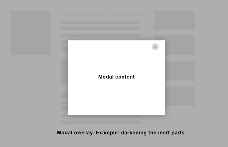
Even if "modal" is mostly used in the context of dialogs, there are rare occupancies of other interface elements being modal: Imagine off-canvas navigation sliding in, for example:
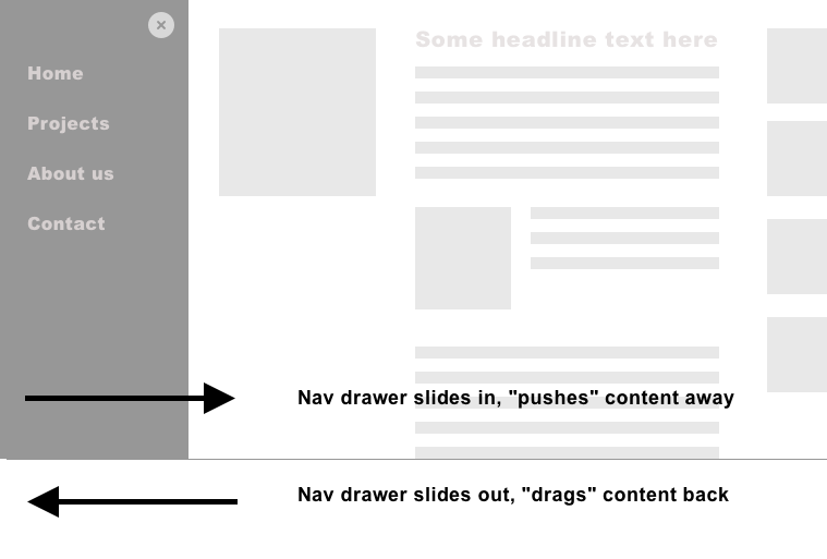
What both interface elements have in common is they force a decision on the user and render another part of the interface inactive. In the case of the modal it is often its "mission" that the user decides something, or at least acknowledges things ("Do you really want to delete this file?"). In the case of off-canvas navigation it is about forcing a decision of where the user wants to navigate. Keep in mind that, although the modals "nature" is to interrupt and to block everything else that one of the choices offered must be a way out. A closing or cancelling action, in the form of a button must be implemented, and the best way is to do this redundantly via an ESC key listener.
Now, there is the attribute aria-modal, and it does exactly what it sounds like: It renders the element on which it is applied on modal (including the part of rendering the non-modal sections of one's inert). Browser support for aria-modal is close to perfect - with one big exception: Its implementation is broken in the widespread screen reader combination Safari and VoiceOver on Apple's iOS. So, at least at the time of writing, the advice and the more robust way of building modal parts of your interface is not to use aria-modal, but instead, go the way of rendering non-modal parts of your interface inert (and hide them from assistive technologies with aria-hidden). More details on that in the concrete implementations of modal dialogs and off-screen navigation in chapter 4.
#Hiding and deactivating elements accessibly
Hiding is not just hiding. You have to differentiate between hiding visually and hiding for assistive technology, like screen readers. At the same time, there is the concept of "inertness" - something is non-interactive but still present on the screen, although displayed disabled. Let's explain the differences:
#Visually Hidden
You may wonder: Isn't "visually hidden" actually CSS's display: none, visibility: none or the hidden attribute?
The short answer is: no. For the long answer, I'll have to backtrack a bit: most screen readers ignore CSS, with exceptions. One exception is that if you apply display: none, visibility: hidden or the hidden attribute to an element: Thereafter, it and its children won't be perceivable by anyone, not even screen readers.
From your existing accessibility knowledge, you know about the importance of a sound document outline built with reasonable headlines. On the other hand, the screen design that was handed to you and that you now need to implement doesn't show any visible headlines above sections and elements. But you learned how important a headline structure is for screen reader users. And you have just learned that display: none hides things for everyone. So what to do?
Luckily, there is the concept of "visually-hidden" (CSS frameworks call the concept "sr-only", which is, in my opinion, just as fitting). Visually hidden things differ from display: none and visibility hidden in that an element is made invisible in the regard that they are still part of the DOM and perceivable by screen readers, but nowhere to be seen. The following code, which uses cropping, collapsing dimensions and hidden overflow has proven to be performant and reliable:
.visually-hidden {
    clip: rect(1px 1px 1px 1px);
    clip: rect(1px, 1px, 1px, 1px);
    height: 1px;
    overflow: hidden;
    position: absolute;
    white-space: nowrap;
    width: 1px;
}
#aria-hidden
Applying the aria-hidden attribute and setting it to true is a strategy to hide content from assistive technology. For example, when an element has this attribute, all of its children and grandchildren (in other words: the complete local DOM subtree) is not discoverable with a screen reader anymore. aria-hidden can be considered the counterpart of "visually-hidden".
Nevertheless, elements with aria-hidden are visually perceivable. Even more, the attribute does not prevent interactive controls inside it from being focused (that is why the fourth rule of ARIA is never to apply it on a focusable element). You can revert the effect of aria-hidden by setting it to false. As accessibility specialist Steve Faulkner phrases it: The use of aria-hidden="false" "has no meaning or in other words has the same meaning as its absence."
#Inert
Inert is an attribute that gets applied to an element with the purpose of rendering it and its child elements inactive. It is meant to be used on elements that you will render temporarily hidden, disabled or off-screen. From a visual standpoint, elements that are inert are often times (partly) visible on the screen but rendered subdued, often either darkened or displayed with a lower opacity.
You will need the inert attribute (or functionality that is comparable) usually in the context of a modal dialog. What makes a dialog modal is that it forces an interface into a state that makes only the dialog itself interactive and perceivable. So, to achieve that "everything is inactive, but the dialog" state you need tools, and the inert attribute is one of them. Interactive elements inside a DOM subtree that is rendered inactive this way are taken out of the tabindex, making them unreachable via the keyboard. Consequently, focus stays within the modal dialog because that is the way a modal dialog is meant to work.
Unfortunately, at the time of writing, no browser supports the attribute (except for Chrome, where it is hidden behind a flag) due to some discussion of its exact behavior in the shadow DOM. Nevertheless, there is a polyfill available. For installing it, you have got two options. The direct way of including the inert polyfill script at the end of your page:
<script src="/path/to/inert.min.js"></script>
To use inert in a Vue project based on vue-cli, install it via:
npm install wicg-inert --save
Then you can import it in your main.js like this:
import "wicg-inert";
In a next step, use the inert attribute like any other in your app. See following code example:
<template>
  <div>
    <div :inert="isInert">
      <a href="http://marcus.io">My website</a>
    </div>
    <label>Is inert?
      <input type="checkbox" v-model="isInert">
    </label>
  </div>
</template>

<script>
export default {
  data() {
    return {
      isInert: false
    };
  }
};
</script>
See this code as a Codesandbox: Vue 3 version, Vue 2 version.
When applied this way, content that is marked inert won't be clickable or reachable by keyboard – exactly what is expected when another element is meant to be "alone on the interface stage", or in other words, "modal".
#Links and Buttons
In theory, it is easy to add click event listeners to literally every element. That is especially true in modern JavaScript frameworks that made it really easy. For Vue, it is as easy as adding @click. In practice, though, there is only one element you should add click listeners to: buttons. Another element that gets frequently assigned click handlers to, are links. The purposes for links and buttons are very different. The first is for navigation, the latter for changing state. Or, with a little more detail:
#Buttons
Buttons are meant for actions on your website, be it resetting or submitting a form (<button type="submit">, <button type="reset">), or triggering actions that change the web app's state, such as showing a dialog. In general terms: They are the best choice when the interaction doesn't lead to a location on your app that can be accessed with a URL or has its own route. Vice versa: If a state is reachable via an own URL, consider to use an <a> element instead. If you place a button inside a form but don't intend to make the said button the one that submits the form, be explicit about this by adding a type attribute of button to it: type="button". If you leave this off, this button could be understood as the form-submitting button by your browser.
One argument against using the <button> element was quite common: "We have to use <div>s for buttons because the button element is hard to style across different browsers and operating systems." While it was hard to reset the visual style buttons cross-browser in the past, this has changed some time ago. Use the following CSS to reset a button to a "neutral" look:
button.reset {
    display: inline-block;
    border: 1px solid transparent;
    text-decoration: none;
    font: inherit;
    padding: 0;
    margin: 0;
    background-color: transparent;
    -webkit-appearance: none;
    -moz-appearance: none;
}
#Links
You have read something about when to use links in the last section already: Use the <a> element when referring or pointing to a document, a file, a piece of content or state that has its own URL. If in doubt, ask yourself the following question: will this interaction lead to a change in browser history? If yes, using <a> is suitable. If not, it is time to use a <button>.
Remember that you can give links pieces of meta-information. When you link to a file and want browsers to trigger the download prompt, <a> elements can be provided a download attribute.
Since we are dealing with actual locations with links, it can be helpful to assistive technology to supply a non-visual marker that indicates the current page or state. Imagine having a list of links. For visual users, you probably indicated the page they are on with a class like .current and styled this link differently from the others. Alas, screen readers don't care about class names (regardless of how "semantic" they are named). You could still indicate the currently active page with aria-current="page" and use this attribute as a "CSS hook" for styling, using the attribute selector:
[aria-current="page"] {
    /* Your "active" styling */
}
Sidenote: The aria-current attribute accepts way more values than just page. If you're interested in the other possible uses, read Leonie Watson's primer "Using the aria-current attribute".
The last two sections are just starting points for the properties of and the distinction between buttons and links. Chris Coyier has created a dedicated page on css-tricks.com where he goes into even more detail: The (aptly named) Complete Guide to Links and Buttons.
#Don't rely on click events alone
If you happen to reimplement button or link functionality by other means, by applying role="button" for example – a word of warning. Be aware of what you are doing and what already comes "for free" when using a native a or button element. What buttons already do for web developers is often underestimated!
A link for example can not only be triggered by a click or a touch event but also by pressing the Enter key. A button even reacts to touch events, link clicks, Enter and Space key presses. Please have this in mind when recreating an element HTML via WAI-ARIA attributes. If you really have to recreate them, please promise me two things:
- Have a very good reason to do so
- Please read through materials such as MDN's page on the button role and Deque's article on buttons thoroughly before you start this endeavour to map the scope of what you are planning to do.
#WAI-ARIA Authoring practices
When you do some research on how to build accessible web apps or widgets and how to use WAI-ARIA properly, you will find a collection of code snippets from W3 Consortium, called WAI-ARIA Authoring Practices. And maybe you have the feeling that I had when encountering them for the first time. My thoughts were along the lines of: "Ok, so the W3C, which is the standard body for all things web has gathered a list of how to work with WAI-ARIA. Everything is just fine if I just use these patterns just like they are."
The truth about Authoring Practices is not so simple. At first, contrary to WAI-ARIA or the Web Content Accessibility Guidelines (WCAG), they are not standards (or "normative" parts of other standards). Rather, they are proofs of concept.
Further, some practices are disputed among web accessibility professionals, while others aren't. Examples for the second group are the disclosure widget pattern or the modal dialog for example. People still disagree on other patterns (e.g menu bars, combo boxes) regarding wording, suitability for mobile use, and advice on when exactly to use this pattern.
To add to that, Authoring Patterns are created in a way that does not recognize how well a certain pattern is supported in assistive technology. This is another reason why you shouldn't make the mistake of simply adopting a pattern into your own project - and assume all is well. Even if said pattern is not disputed among specialists, the lack of real-life support regarding assistive technology would mean that it likely will cause more harm than actually help for people affected.
Web accessibility specialist Adrian Roselli summed up the situation around the Authoring Practices on one tweet in a brief but tongue-in-cheek way (Source @aardrian Twitter ):
There are issues because the patterns are often incomplete, untested, or make use of ARIA in a way that is trying to turn the web into Windows 95. APG patterns are experiments. That is it. Few are production ready, all require testing.
Design consultant Peter van Grieken rightfully critiques that the Authoring Practices are - at first sight - not distinguishable from actual standards (Source) and suggests improvements (Source):
Having the authoring practices on the W3C site is problematic, imo it does more harm than good and it gives it too much authority. (even though it’s a "Note", which apparently is W3C-speak for "this has no value whatsoever")
(...) without proper testing they are little more than expert blogposts. They could be much more valuable when properly and thoroughly evaluated
So if Authoring Practices are about the "pure" use of WAI-ARIA, and some of them can even be disputed, incomplete or only partially supported in assistive technology – what can you do about it?
Alas, there isn't a silver bullet. But here's my strategy, and it can be summed up by one word, "research":
- Find out: is the pattern of your choice disputed or not? Fortunately, the discussion regarding that is held online on GitHub. Look into the issue sections of this repository and search for the pattern name specifically. Are there open Issues? Is there a lively discussion around it? What do the experts say?
- You also need to have support in assistive technology (AT) in mind before deciding in favor of one pattern. In a perfect world, you would run tests with AT and users, but the next best thing is once again to look out for discussions regarding the pattern (in the GitHub Repo stated above) and to check the page a11ysupport.io AT compatibility data.
- Lastly, check whether people known for their accessibility expertise (see chapter 7) have written about the pattern in question. Either in the form of social media updates, blog posts or even example code or pattern libraries. It does not hurt to start with a guy called Adrian Roselli, as mentioned above.
#Action Steps for this chapter
- Try to use an app or website with the keyboard only. If you can't see where the current focus is, take note and realize this is a barrier that many people encounter. Paste the following code into the browser's console and keep track programmatically what's in focus:
document.addEventListener('focusin', () => {console.log(document.activeElement);}); - Take note as well if there are elements focussed that are off-screen or obscured.
- Visit the Authoring Practices page, but keep in mind that the patterns you find there are partly proofs of concept - not gospel. Visit the GitHub page and look at which practices created discussions.
- Open a CodePen and play around with visually-hidden, aria-hidden and inert (and how it all connects with keyboard access - or not).