After two introductory chapters, let's finally talk Vue. In the following, we will start to think about strategies of using the framework's strengths for building inclusive apps.
#Conveying context with props
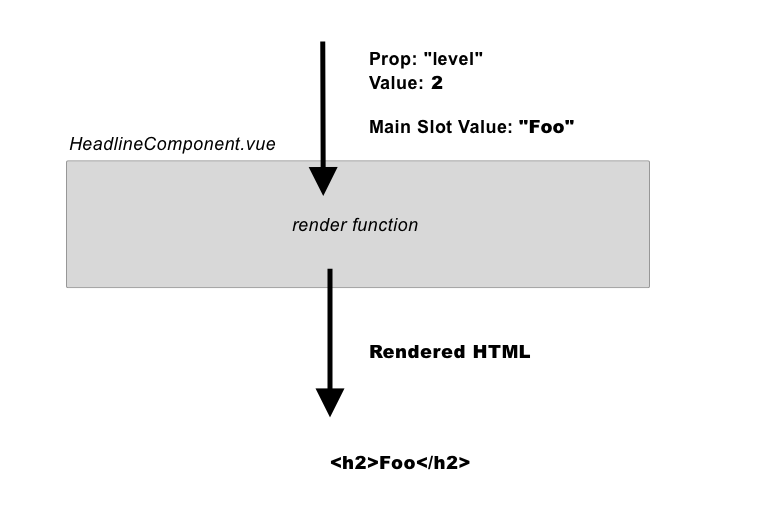
Props are a concept established by JavaScript frameworks "of old" such as Angular and React, and designed to pass pieces of data into components. An obvious example of how to use props for accessibility is a headline component. Headline levels are important for the overall document outline, not only for accessibility but also for search engine optimization reasons. So heading levels of components should be flexible across pages. A component's position within a document and within an established headline structure should determine its own headline levels. In other words: context is king, and useful heading levels their crown.
Both assistive technology and search engines use the heading hierarchy they find in a document to get a first impression about its structure and relationships. Screen reader users mostly use headings to navigate within a document or app, instead of traversing through the HTML node by node. To maintain a reasonable headline hierarchy, and to acknowledge the fact that headline structure could change from page type to page type (template) are two good reasons headlines should never be hard-wired in components but designed to be dynamic.
<template>
    <div>
        <h2>List of JavaScript frameworks and libraries</h2>
        <ul>
            <li v-for="lib in libs"></li>
        </ul>
    </div>
</template>
<script>
export default {
    props: ['libs']
}
</script>
Component instances aren't aware of the part of the document outline there are placed in, unless they are given context. So the simplest solution is to pass this context as a headline level with props:
<template>
    <div>
        <component :is="headline">List of JavaScript frameworks and libraries</component>
        <ul>
            <li v-for="item in items"></li>
        </ul>
    </div>
</template>
<script>
export default {
    props: ['headlineLevel', 'libs'],
    computed: {
        headline() {
          return "h" + this.headlineLevel;
        }
    }
}
</script>
See this as a Codesandbox: Vue 3 version and Vue 2 version.
#Requiring props
Another strategy for using props to improve your app's accessibility is to work with required props. Imagine you are planning to transform a text input element into a base component:
<template>
    <input type="text">
</template>
This component could then be used like this:
<BaseTextInput />
So far, so bad. People familiar with web accessibility will notice that the code in our BaseTextInput.vue is a violation of inclusive design: The created an input element, but did not supply a label for it, leaving users of assistive technology clueless about its name and purpose. Of course proper code for a text input element should look like this:
<label for="name">Name:</label>
<input id="name" name="name" type="text" @change="updateValue">
Considering the code above, we have the skeleton for an accessible text input component. The existence of a label is obligatory for all input elements, so let's make it a mandatory prop (comment 1).
<template>
    <div>
        <label for="name"></label>
        <input id="name" name="name" type="text" @change="updateValue">
    </div>
</template>

<script>
export default {
    props: {
        label: {
            type: String,
            required: true // (1)
        }
    }
}
</script>
This way, you made sure that a label prop is provided. In the case it is omitted, your browser console yells at you:
[Vue warn]: Missing required prop: "label"
Theoretically, you can use the same approach for other ways of labeling inputs and controls. Your label prop could supply the value of the input's aria-label attribute, or the text content of the element its aria-labelledby attribute points towards. However, please be aware of the disadvantages of these solutions – when you are using aria-label you are providing an accessible label to assistive technologies only. There will be no visible output. In contrast to this, the situation for aria-labelledby is more complex. This attribute is a so-called relationship attribute, and instead of taking a string of text (that will eventually be the label of the input), it takes one or more ID references to other elements. If elements that are being referred to by aria-labelledby are hidden, this approach shares the disadvantages with aria-label.
Dive in deeper into labeling controls (and every other element with a valid role) with Leonie Watson's article "What is an accessible name?". Read Eric Bailey's "Don't Use The Placeholder Attribute" to learn about the problems with this particular attribute and especially why you should never use it as a label.
Of course, the use of required props for accessibility is not limited to labeling of inputs. Here are some more usage examples:
- If you happen to have a dedicated image component, you could make sure that every image has an
altattribute (purely decorative images can have an empty alt text, but omitting the attribute is never an option) - Same goes for inlined SVG that is wrapped within a component. While an
altattribute is not working here, you could enforce required image descriptions that end up as a value foraria-labelor for a<title id="desc">attribute within the SVG itself that is being referenced:aria-labelledby="desc". For more details on labeling SVGs and your possibilities of giving icon buttons accessible names, read Sara Soueidan's article "Accessible Icon Buttons". - In case of these icon buttons, you could require a prop called
labelornamein your component to supply an accessible name. Its value could be passed to anaria-labelattribute on the button itself. Of course, labeling the icon directly would be even better, but with this approach, at least we can make sure the button has some information about its purpose. - If you have a component that is basically a fieldset, you could create a
nameorlegendproperty on it. By making it mandatory, you can assure that the rendered fieldset has a legend (given that you use its value as the text of the fieldset's<legend>element). If you plan to wrap radio inputs together specifically, there's an ARIA role ofradiogroup. Providing a required label could work the same way, with the difference of it not being a<fieldset>/<legend>construct but the following:<div role="radiogroup" aria-labelledby="radiogroupLegend"><div id="radiogroupLegend">Radio Group</div>..</div>. - When dealing with a multi-language website with Vue, you could require a prop on your components regarding the language. What will be passed through that prop will be the value of HTML's
langattribute. Although the language of a document is usually set on the document level (by<html lang="en">), there can be cases that some component's text content is written in another language. Forcing developers to declare that language could hence improve accessibility. - If you happen to build parts of data tables, you could push your team or yourself to provide a summary for every table instance. The content of such a
summaryprop could fill the table's<summary>element. In case you are using thethelement for table header cell markup, a requiredscopeattribute could help assistive technology detect if this header is meant for a row or column of a cell. To learn more about these elements and attributes related to accessibility in tables, visit MDN web docs.
#Circumventing Vue 2's one-root-element rule
I bet you have seen this console output before:
Error compiling template:
Component template should contain exactly one root element. If you are using v-if on multiple elements, use v-else-if to chain them instead.
I also assume that you have solved this issue by wrapping the component's content in a <div>, and the error above message went away. This nice and well for most situations, but there are scenarios where "needless" elements actually lead to invalid HTML and, thus, problems with assistive technologies such as screen readers.
Let's imagine you have a table component that is a mere wrapper around a component including all the actual data:
<template>
    <table>
        <caption>A sample table</caption>
        <TableData />
    </table>
</template>

<script>
import TableData from './tabledata';

export default {
    components: {
        TableData
    }
}
</script>
Let's imagine further that your table data consists of three free-roaming table rows. The following code is what is expected in a table, but does not follow Vue 2's (and React's) "just one root element" rule:
<template>
    <tr><td>Just</td><td>some</td></tr>
    <tr><td>arbitrary</td><td>data</td></tr>
    <tr><td>cells</td><td>here</td></tr>
</template>
So you do what you often do in these cases and wrap these table rows in a parent element, for example a <div>:
(The following code has a WCAG violation, do not copy)
<template>
    <div>
        <tr><td>Just</td><td>some</td></tr>
        <tr><td>arbitrary</td><td>data</td></tr>
        <tr><td>cells</td><td>here</td></tr>
    </div>
</template>
So, that's it? Not quite, unfortunately. The following code will be rendered out in the browser as a result:
(The following code has a WCAG violation, do not copy)
<table>
    <caption>A sample table</caption>
    <div>
        <tr><td>Just</td><td>some</td></tr>
        <tr><td>arbitrary</td><td>data</td></tr>
        <tr><td>cells</td><td>here</td></tr>
    </div>
</table>
Although the result of this HTML won't look broken in browsers (due to their high error tolerance when it comes to markup) it is invalid HTML. Consequently, it has to potential to harm assistive technologies like screen readers. What can be done about this? Luckily, there is a concept called fragments. It was first introduced in React 16.2. And since they share the architectural problem, Vue 2's take on fragments is similar. Although, unlike React, it is a component you have to install manually since it is unfortunately not part of Vue 2's core:
npm install vue-fragment --save
After successful installation, you can use the then available Fragment plugin globally, or just in the components needed:
<template>
    <fragment>
        <tr><td>Just</td><td>some</td></tr>
        <tr><td>arbitrary</td><td>data</td></tr>
        <tr><td>cells</td><td>here</td></tr>
    </fragment>
</template>

<script>
import { Fragment } from 'vue-fragment'

export default {
  components: { Fragment }
}
</script>
To conclude: these "basically root-less components" are a concept that not only helps you write valid code that is not contaminated with unnecessary wrappers, but also make your styling with CSS easier (quote by React's Dan Abramov):
Some CSS mechanisms like Flexbox and CSS Grid have a special parent-child relationship, and adding divs in the middle makes it hard to keep the desired layout while extracting logical components.
#Facilitate focus management with $refs
Refs are a way to refer to elements within the template part of our component. Instead of using DOM-querying methods like .querySelector, you can add the ref attribute to a node and now have a reference to it within the this.$refs object.
This is particularly useful if you want to manage the focus of your app (see Chapter 2 for this concept).
Focusing an element programmatically is as easy as calling JavaScript's native .focus() method on it. For the next example, let's assume we have a button somewhere in our component and applied a ref named triggerButton to it. We want to set focus to it once the user hits the ESC key.
<template>
    <div @keydown.esc="focusTriggerBtn">
        <button ref="triggerButton">Trigger</button>
    </div>
</template>
<script>
export default {
//...
methods: {
    focusTriggerBtn() {
        this.$refs.triggerButton.focus();
    }
}
//...
}
</script>
Find this little code example on CodeSandBox for Vue 3 and Vue 2.
#Controlling where attributes get applied to
Under normal circumstances, when you add attributes to a component, they will be added to its container. What do I mean by that?
Imagine you want to use the BaseTextInput component from the start of the chapter again. This time, you want to add HTML 5's disabled to it (as a standard HTML attribute and not a prop).
<BaseTextInput label="Your Name" disabled />
Vue's standard behaviour up until to Vue 2 was to add received attributes to a component's wrapper, leading to the following code. Applying disabled to a <div> is not what we intended:
(The following code is a bad example, do not copy)
<div disabled>
    <label for="name"></label>
    <input id="name" type="text">
</div>
Luckily, there is a way to control precisely where received attributes will get applied. In Vue 2, doing so consisted of two parts, setting inheritAttrs to false (comment 1) and adding an explicit binding of attributes (comment 2):
<template>
    <div>
        <label for="name"></label>
        <input id="name" type="text" v-bind="$attrs"><!-- (2) -->
    </div>
</template>

<script>
export default {
    inheritAttrs: false // (1)
    // other options,...
}
</script>
Whereas in Vue 3, you can omit the explicit option inheritAttrs and directly use v-bind="$attrs" on the element of your choice. Also, compared to Vue 2, the class and style attributes are treated like every other non-prop related attribute that gets passed in.
See corresponding CodeSandBoxes for Vue 3 and Vue 2.
#Visibility helper components
In the last chapter, you read about the different types of hiding and deactivating things. One of these strategies was "visually hidden", and it serves the purpose of hiding elements visually, without removing them from either the DOM or accessibility tree. This way, it can be made sure that visually hidden content is still available for assistive technologies such as screen readers. To improve developer convenience, a <VisuallyHidden /> helper component could be established. You may wonder: why not use a helper CSS class with the same functionality? React developers with accessibility in mind have discovered interesting uses that arise, once you have such a component at hand:
- A team working on the design system of the websites for the British government improved their
<VisuallyHidden />component with afocusableprop. This way a component can be made visible again once it gains focus. Interestingly, this is exactly how a skip link works (you'll learn how to implement them in Vue in chapter 4) - Kitty Giraudel, then working for the fin-tech start-up N26 proposed and demonstrated a prop that conveys the semantic meaning of your
<VisuallyHidden />component. This could help improve your document outline, when you use it for visually hidden headlines (see last chapter).
Both concepts are implemented in the following example code:
<template>
  <component class="visually-hidden" :is="tag" :tabindex="focusable ? 0 : null">
    <slot/>
  </component>
</template>

<script>
export default {
  props: {
    tag: {
      type: String,
      required: false,
      default: "span"
    },
    focusable: {
      type: Boolean,
      default: false
    }
  }
};
</script>


<style scoped>
.visually-hidden {
  clip: rect(1px 1px 1px 1px);
  clip: rect(1px, 1px, 1px, 1px);
  height: 1px;
  overflow: hidden;
  position: absolute;
  white-space: nowrap;
  width: 1px;
}

.visually-hidden:focus {
  clip: auto;
  height: auto;
  width: auto;
}
</style>
Eventually, the helper component can be used this way:
<VisuallyHidden tag="h2">I'm still there</VisuallyHidden>
See Codesandboxes for Vue 3 and for Vue 2.
#Accessible Base Components
It's a good idea to build components accessibly, and it's an even better idea to make it easy for developers to use them. One convenience that could be added is to remove friction when it comes to importing components that are often used. Vue has a concept for that called Global Components. When a component is global, it is automatically imported and registered in any other component. Your, for example, <BaseInput /> with the mandatory label prop (see above) is available everywhere in your app and "only needs to be used".
What components should be global? The answer depends on your project, but a rule of thumb is: Components that you import over and over again and components that you want to be used in an accessible way are good candidates for becoming global. I consider the concept especially effective in a team where the level of accessibility knowledge differs.
Global and accessible base components could be, for example, text inputs, buttons, SVG icons, or tables – each of them are built in an accessible way once (and by using required props for example).
In concrete terms, how do you register global components? The Vue.js documentation presents two ways for this:
#Importing them in App.vue manually
Your base components are manually imported and registered in App.vue. This has the disadvantage that all the imports and registrations have to be done manually (that can be tiresome when you got lots of Base Components), but at least it only has to be done once, and all of your Base Components are now available everywhere in your app:
import BaseButton from './BaseButton.vue'
import BaseIcon from './BaseIcon.vue'
import BaseInput from './BaseInput.vue'

export default {
  components: {
    BaseButton,
    BaseIcon,
    BaseInput
  }
}
#Automatic global registration
But the official Vue documentation presents an alternative way: Based on a file name convention (for example the prefix Base or base-), components are imported automatically. For that the following code is necessary in your app's entry file (for example src/main.js, if you created your project with vue-cli):
#Vue 3
import { createApp } from 'vue'
import App from './App.vue'
import upperFirst from 'lodash/upperFirst'
import camelCase from 'lodash/camelCase'

const requireComponent = require.context(
  './components',
  false,
  /Base[A-Z]\w+\.(vue|js)$/
)

const app = createApp(App);

requireComponent.keys().forEach(fileName => {
  const componentConfig = requireComponent(fileName);

  const componentName = upperFirst(
    camelCase(fileName.replace(/^\.\/(.*)\.\w+$/, '$1'))
  )

  app.component(componentName, componentConfig.default || componentConfig);
})

app.mount('#app');
#Vue 2
import Vue from 'vue'
import upperFirst from 'lodash/upperFirst'
import camelCase from 'lodash/camelCase'

const requireComponent = require.context(
  // The relative path of the components folder
  './components',
  // Whether or not to look in subfolders
  false,
  // The regular expression used to match base component filenames
  /Base[A-Z]\w+\.(vue|js)$/
)

requireComponent.keys().forEach(fileName => {
  // Get component config
  const componentConfig = requireComponent(fileName)

  // Get PascalCase name of component
  const componentName = upperFirst(
    camelCase(
      // Gets the file name regardless of folder depth
      fileName
        .split('/')
        .pop()
        .replace(/\.\w+$/, '')
    )
  )


  // Register component globally
  Vue.component(
    componentName,
    // Look for the component options on `.default`, which will
    // exist if the component was exported with `export default`,
    // otherwise fall back to module's root.
    componentConfig.default || componentConfig
  )
})
However, the most essential factor of accessible base components is nothing technical. It is a question of communication: promoting their usage within your team is nearly as important as ensuring accessible markup. A project where accessible base components only live in an obscure folder without the chance of ever being part of an interface provides no value to your users.
#Action Steps for this chapter
- Look into the headline levels of a Vue application you built (for that, I recommend the browser extension HeadingsMap. Ask yourself: Is the document outline created by the headlines present sound, are headlines nested in a logical way? Does it need some alterations? Could a
HeadlineLevelcomponent be of use? - Look into your Vue application again: Is there a use case for base components? When you are using some already, are they accessible (for example, do they have labels, don't rely on
placeholderattribute alone, have focus styles, et cetera)? - Validate the HTML output of your Vue application's with W3C's official validator:. Are there violations related to attributes being applied to the wrong HTML element? If so, could this be solved by an explicit binding of a component's attributes?